

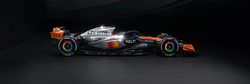
Quite a bit too much white (and blue) imo. It doesn’t really look like a Ferrari to me. It looks fine, just not like a Ferrari.
It kinda looks like a 2016 Ferrari. Or a Marlboro Ferrari which had a lot of white back in the day. Or a Prema F2 livery.
Where do they store the pain?
It reminds me of the old Marlboro Ferraris. I like it.
You see that ZYN logo? That’s Phillip Morris, so yes it is supposed to look like tobacco addictives sponsorship because it is. The reality is after Enzo Ferrari died, they changed the color of Corsa red to match the Marlboro red.
Reminds me of a video I came across recently
The back of the top intake looks like it hasn’t fully rendered.
It’s so funny that F1 bans cigarette ads but nicotine punches (ZYN) are perfectly fine lol
The way that’s shot is messing with my brain. It looks tiny, like toy matchbox car small.
Still not a fan of the HP logo. The livery is fine though.
I can see these front wings causing some carnage though!
HP logo ruins everything, and the two on the rear wing almost look like eyes. The smiling face of HP basking in its investment, I guess.
I also kind of wish it had less black on it. Like, wouldn’t it look better as purely red and white? White rear and front wings, maybe?
I can see these front wings causing some carnage though!
I’m curious to see how robust they are. Will they shred tyres or just get run over/broken off? Return of the meatball flag?


