

- cross-posted to:
- thanksihateit@sh.itjust.works
- cross-posted to:
- thanksihateit@sh.itjust.works
You must log in or register to comment.
deleted by creator
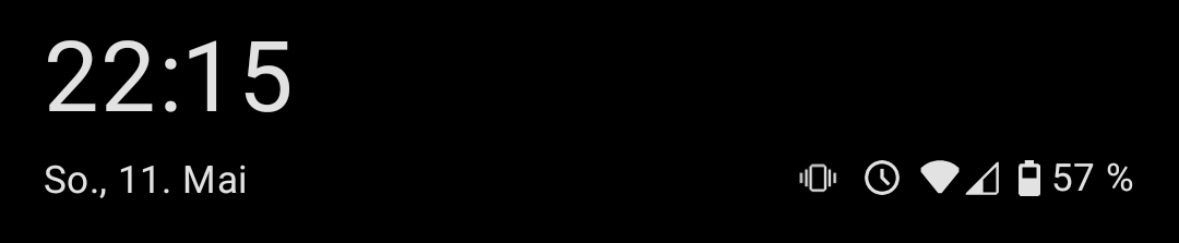
And it shows up on the AOD now, and you can’t get rid of it. Plus, they changed smart select to some “draw on your screen” bulletin that takes an extra button press to get to, and it works worse than the version before at auto sizing to what you wanted.
They also changed the options for app grid layout to remove the 5x5. Now you just have 6x4 and 6x5. Plus the colors of the icons changed, and the default weather widget changes. I had my home screen in a way that I was used to, and now it’s all over the place. I feel like everything that was OK before got a huge downgrade, probably to make room for AI bullshit.
My AOD clock is bouncing around now and sometimes get clipped off the screen
I don’t mind it. Wish the notifications were more compact, but that’s about it.
deleted by creator
third-party android modifications*
my family’s pixel devices, and mine running gos, don’t have this. nor the cell bar style, nor the ‘we have to advertise the wifi version so people feel good that bigger number = better’ wifi icon style…
the default is just a battery icon, though I have it set on my phone to also show the percent alongside it. this hasn’t changed in many years. blame your manufacturer and their skinning and modding.
Yeah seeing the post had me worried for a while but appears it’s not and android thing but a Samsung thing. This is why I stopped buying Samsung phones 6 years ago.
Oh thank God. I’m probably going to update my Pixel soon and was worried
Samsung updates, they ruin android more and more with each one. The quality of the ROM an android comes with is a very underrated thing to consider when buying. Pixels are very close to stock android. Nothing is also good, farther from stock but the changes are for the better imo. OnePlus was good last time I had one, but not sure if they still are.
I AM STILL PISSED ABOUT THIS FORCED UPDATE. the second a linux phone is usable daily I will buy one. FUCK SAMSUNG
just get a phone with lineageos support?
Sounds like you already have one. Samsung phones are pretty bad though.
deleted by creator
Would the Google pixel not retain some line to Google? I’ve been leaning more and more towards getting away from Google and Microsoft. With Linux, I’m scared I’ll have an unsecure system just by virtue of not knowing dick about Linux except the little coding I’ve taken courses on that barely scratched it.
Only reason I got Samsung was the cameras on the S22 or 24 or whatever it is I have. Pixel has good cameras, I’ve heard, but it’s entirely Google. Does putting Ubuntu remove all that…?
Sorry if not the place to ask.
deleted by creator
Oh, interesting. Thanks for the heads up!
My autocorrect/word suggestion box is white with a slightly less white font.
What was it before this?
Just a percent

This is mine on Android 14 on OnePlus.
We can even change it. Is that not possible (anymore) on Samsung?
LineageOS 22.2 (Android 15)

It looks the same on my 2024 Moto G Stylus. In fact, the battery icon with the percentage next to it has been an option on every Android phone I’ve used for the past decade or so, at least.
Same. I think it’s a Motorola thing. My current and last few phones for the past 15 years have been Motorola.
I’ve had a OnePlus phone during that time and they had the same option.
Readable.
A battery icon
Oh fuck, I hate this too. Fucked up the video player and a bunch of my settings as well. Why is everything so round!? Why did they fuck up my clock widget SO BAD!??
Yeah I am sticking with my custom rom until the phone dies. Then probably getting a Sony phonr because those apparently have a no nonsense android on them.
I have two Sonys and love them both. I like that they’re thinner so it’s easier to hold, too. Still have headphone jack and side fingerprint reader.
Good to hear. I had a sony a while ago. Xperia Z1 compact I think. Great little phone it was. Sadly they now only make really high end phones anymore.
There’s always the 5 or 10 models. Those are still great and also pretty affordable if you scoop them on Swappa or eBay
I was actually thinking of getting a 1 year old model from ebay. Might reconsider again
Yeah I’ve bought my last Samsung. These over-redesigned UIs that nobody asked for piss me off. If I wanted ugly Apple trash I’d buy ugly Apple trash.
deleted by creator
get a pixel and install lineage, it’s quite easy (you just need to fiddle with adb a bit) and you can achieve a 95% flawless experience. only thing that doesn’t just work for me is the fucking mcdonald’s app
I have an older phone with lineage. Currently using crdroid because I chose badly and nobody is really making custom roms for my current phone. I am not buying a pixel just because.
It looks almost exactly like the apple one
It does not. Apple’s is a little battery. This looks more like a notification badge. Corner radius is too big, and it needs a nipple.
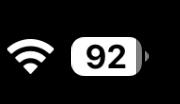
Not much that isn’t better with a nipple. Not going to argue with that
deleted by creator
I like it. The “progress bar” style fill is nice and clear, and it’s so much better than having an icon with a number next to it. “BuT iT dOeSn’T lOoK LiKe A bAtTeRy” what, do you think your phone is full of AAs? A plain oblong is actually closer to the mark.
For me it’s not about liking. My eyes aren’t as good as they were and the far worse contrast combined with the smaller size worsens the readability significantly.
(Don’t rush but you’ll get there.)
I just hate the greyed out bit. To much like it’s partially selected.
that’s just samsung though, i’m on android 15 too and my battery looks like a battery
i just updated to latest lineage and the only change to my battery icon is that it shows a little shield icon when charging is paused, which is very nice and i particularly appreciate that it works seamlessly with non-built-in ways of limiting charging! (acca specifically in my case)
Is this oneUI 7? If it is, tell me so i can stay in 6.1 when the update comes.
I think it’s 7
Yup. Avoid it if you can
They should’ve just copied iOS and made it look like a little battery.
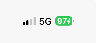
The arrow shows on which side the battery is.
It’s there! ▶️


