- cross-posted to:
- itsme@lemm.ee
- cross-posted to:
- itsme@lemm.ee
You must log in or register to comment.
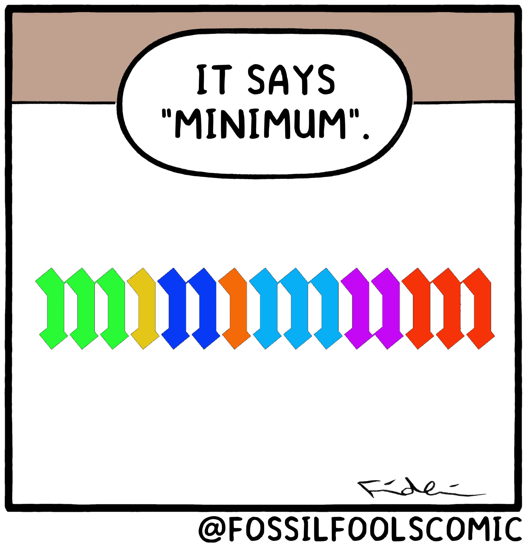
After like 5 tries and squinting and using my finger to block lines as I went along, I managed to verify for myself that it does in fact have the proper amount of lines.
It’s not just the correct amount of lines but connections between the lines are actually there, if they should be that is, if you look closely.
Oh shit you’re right
Wow. You really had to zoom in for that one. +2 to the artist for such attention to detail.

calligraphy has a patron demon, not a patron saint
Reminds me of Russian handwriting. Always funny to show foreigners.
Is this how calligraphy looks to people who can’t read cursive?


