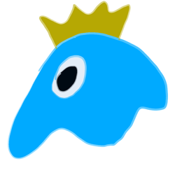
We’re proud to reveal the logo for CoMaps — designed and chosen by the community.
From maps to code to design, CoMaps is 100% community-powered — and this logo is no different. It’s a symbol of what we’re building together: free, open, and offline map navigation for everyone.
The winning logo was created by @Flummic. The initial round had 21 logos submitted, resulting in 6 finalists, followed by an iteration process where people collaborated to make improvements (https://codeberg.org/comaps/Governance/issues/78).
Thank you to everyone who shaped this milestone. We’re just getting started.
Nice. Are you going to replace the “?” icon in the app with the logo? I kinda wish that button would be removed to make the ui simpler/leaner.
Yes. They are going to replace the ? with the new logo: https://codeberg.org/comaps/comaps/pulls/862
I think it’s clever. You can see both the C and the O from Co in it, with the pointer inside indicating it’s a mapping app, so it sort of spells out CoMaps as a logo
Congrats!
Does this work with android auto?
I can’t get it to work running GrapheneOS, and I’ve tried all suggestions I could find anyway, including a hidden settings menu and downloading it from PlayStore instead of FDroid. Still can’t get er going.
It only works with Android Auto from the Play Store, it’s a Google requirement. It’s possible that GrapheneOS may have services turned off which are needed for it. We can help at support@comaps.app
Organicmaps had support for it, so i dont see why it would have disappeared after the fork. I have no idea how android auto even works tho so idk lol
I voted for the needle logo. I am sad it did not win.
Cool
Why not let a graphics designer do it?
(Just curious)
There is no graphic designer at CoMaps, anyone was welcome to submit a design, including designers, and a few of the logos in the first round were by designers.
Anyone was welcome to submit suggestions, including graphic designers.
I like it, though just the text was kinda growing on me

deleted by creator
Nice.
It’s not blue! Hurray!
Excellent. One of the ones I was hoping for. Clean and pretty nifty.
Revolutionary
neat!
Looks really nice. Good branding is so important. This will certainly help people get more people on board, but I hope it’s even more than expected.
They have “GoMaps Lego”? like, some navigation with lego render layer that turns everything into lego buildings… woah impressive! gonna see that… oh, my eyes needs sleep!
oh, that even wasn’t G


