

… the Messages conversation shortcut for my girlfriend has made her into an ugly demon. It’s kinda crazy that Google also applies it to deep-link shortcuts as well. Feels very lazy.
Why would you ever turn that on? In any form it’s ugly as fuck and frankly embarrassing that a whole ass group of developers has gone this long without seeing grass much less touching it.
You seem troubled. Have you considered therapy?
I love it, and it’s an option. No need to be angry about it
deleted by creator
they’ve been addicted to copying apple’s homework since 2018, even back when usability studies were showing android had the more accessible ux. but under capitalism, the market will always lead competitors to copy each other until all choice is washed away leaving de-personalization
None of the Android 16 changes so far have made my phone nicer to use. Most of them have been jarring and unpleasant. This is absolutely vile.
I still don’t understand why google decided to make all icons the same color. It’s a usability nightmare and seems to ignore how we notice color before shapes. The colors are also pretty limited and most icons end up looking the same.
I understand wanting all icons to be consistent but I wish google should have tried changing the saturation to be more consistent or shifting all colors to follow one app.
It doesn’t help how most stock launchers don’t let you use icon packs and google wants to kill 3rd party launchers.
This is the same Google who decided that their entire suite of apps should have slightly differently-shaped blue/green/red/yellow icons instead of anything recognizable
when consistent branding supersedes accessibility in priorities
I mis-click Google apps almost daily. It’s the stupidest fucking icon design.
Meh, I like it 🤷🏻
My first Android device came with Android 10/11, but it wasn’t until Android 12 that I started to dig the Android UI.
Fair enough. I actually like most of material U’s decisions.
Yah. This doesn’t work if you are scrolling through several dozen apps in the app drawer. They all look too much alike.
This setting doesn’t affect the app drawer, it’s just for the home screen which are apps you place manually to be fair - I like the consistency.
That can work then. I might try it.
Idk who the fuck decided monochrome was a good idea. It’s so goddamn ugly and impractical. Must have been a rust dev
Edit: 7 rust devs with no sense of humor and counting.
I’m not even a rust dev lol, I just don’t like jokes at other ppls expense.
You have beef with a programming language
Wouldn’t it be lazier if they didn’t do it? Or what’s the alternative? Personally, it would really bug me if one icon was not like all the others.
Well considering the app shortcuts/deep-link shortcuts aren’t app icons maybe Google shouldn’t have enabled Material You on them? Even if the app supports it by providing a greyscale bitmap, most of the app shortcuts icons don’t so now if you use app shortcuts heavily (which I do) your home screen is now ugly.
And I don’t want to lose the app icon theming just to fix this. I feel like this could’ve been a beta option so I can choose to force it or not.
The problem is that they are naively inverting the colors, which doesn’t work for photos. Lazy, yeah.
In principle I think it makes sense (as much sense as the feature in general, anyway). Personally I do not understand the push in iOS and Android to make all icons look the same, but if that’s what you want, then excluding shortcuts would be an eyesore, right?
It’s not just photos though.
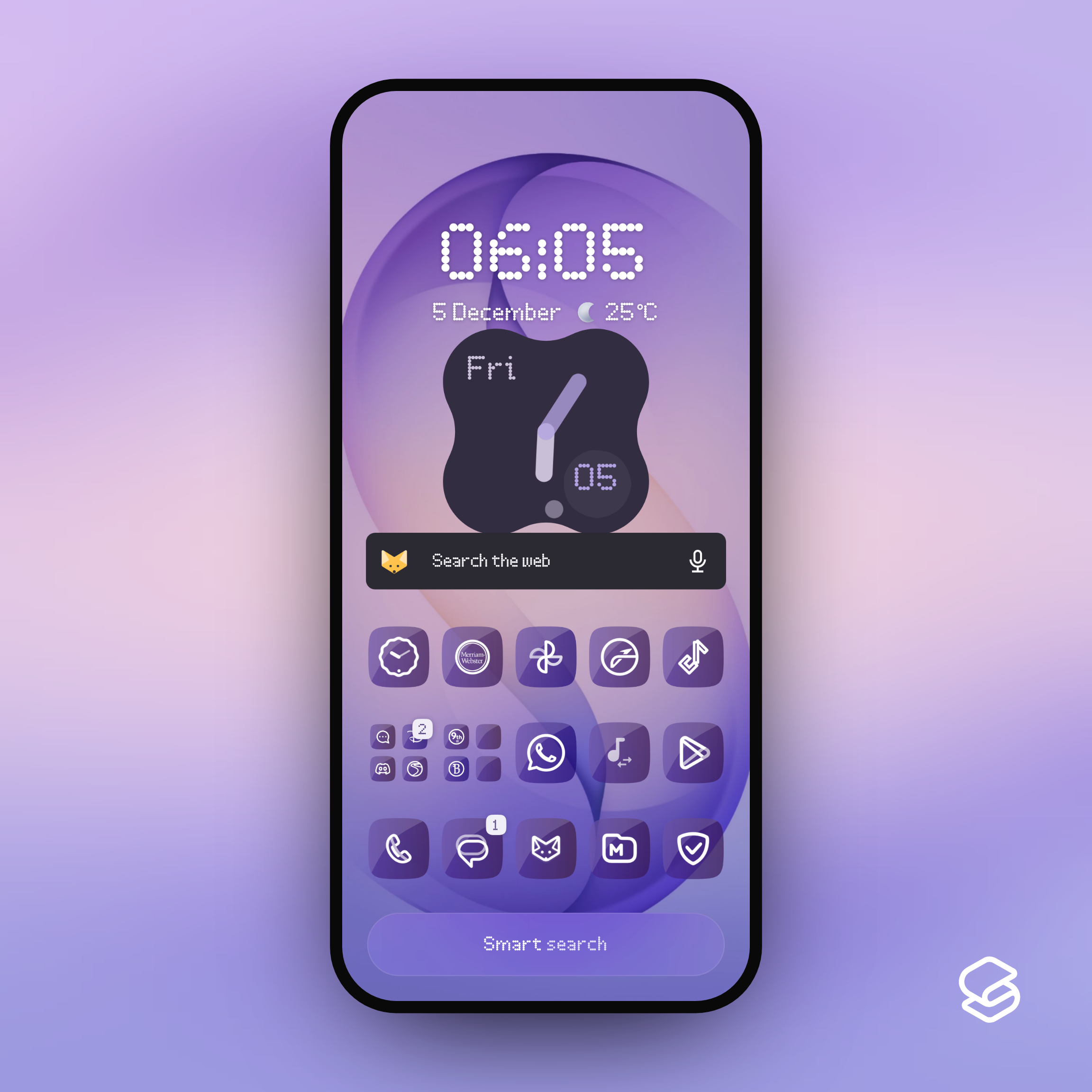
I have a folder of apps and app shortcuts here. Most of these apps support the dynamic icon theming, but the shortcuts use other icons that clearly don’t. So yeah, before this update this folder looked a bit uneven as the app shortcuts were coloured, but now it looks uneven because the app shortcuts look weird and different.
I’ll get over it… 😅

Man that’s sloppy. How the hell did no one at Google think auto-converting profile pictures from chatting app shortcuts was a bad idea?
Isn’t this the type of basic issue the public betas were supposed to catch? 🤦Personally, I’m more effed by the borders and the squigly icon shapes of your launcher.
But, you can use a 3rd party icon pack like Material You or Material You dark/light icon pack. Or maybe use Icon Pack Studio to create a custom icon pack for your phone.
I don’t want to piss about with icon packs and custom launchers these days. That was very much a “12 years ago” kind of thing for me.
The icon shapes are already customisable on the stock Google Launcher and I rotate them to keep things looking fresh.
“forces” how? This shit drives me absolutely nuts, I can never find my apps.
Yep. I need all apps in different colors and different icons.
Poor wording on my part.
Theres a feature in Android since Android 12 that you can enable which forces app icons to use the greyscale icon (which all developers must provide going forward), and then theming it to your OS colours (Material You).
Until now if an app didn’t have that greyscale bitmap icon it would show the original full-colour icon instead. The latest update means if you enable the feature ALL your apps, including those deep link shortcuts, will be forced to colour-match.
So you don’t see this unless you turn it on, but you can’t get back to the pre-16QPR2 state where most apps follow the scheme and some apps are left as their original icons.
Wow that looks like ass
ever since android 13, it has been downhill in Android’s ui department, “it looks pretty” it does, it also is an eyesore to look at same pastel color nonstop, it also kills contrast, it also didnt improve anything, if anything made it worse, specially now that it is forced, it simply harder to tell one app apart from the other without COLOR, a lot of apps had clear distinct and colorful icons that now blend in the sea of bland pastel accent color, the only reason they got away with it was that it wasnt nearly as aggregious as what apple is doing now with liquid shit
All for customization here, so I’m glad for others to make bad UI customization choices for themselves lol.


