- cross-posted to:
- sociology@mander.xyz
- cross-posted to:
- sociology@mander.xyz
You must log in or register to comment.
That color scheme was a choice.
Oh fuck, you got a point… ☹️
Computer, overlay a red/blue scheme for governor party affiliations per state at 60% transparency.
Absolutely unsurprised it’s black in Florida and Texas. Almost like they were taken there on working visas for cheap labor, or something.
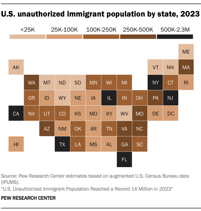
All of the highest population states are in the highest category, because the number isn’t represented per capita.
Also, this color scheme, wtf
Based, those are rookie numbers 😈
Shouldn’t it be as a percentage of the state population?
I don’t believe thats what they were trying to represent in this graph. This is estimating the total, not percentage.
Yeah, but 100K in a 1 mio people state is a lot. Where as 100K in as 30 mio people state is not that many, and thus I think both should be shown
I agree it would be nice to see a percentage based map as well, but OP didn’t post that
Yeah, as it is it’s basically just a population map.


