Innerworld@lemmy.world to Data is Beautiful@lemmy.worldEnglish · 22 hours agoU.S. unauthorized immigrant population by state, 2023www.pewresearch.orgimagemessage-square11fedilinkarrow-up19arrow-down121cross-posted to: sociology@mander.xyz
arrow-up1-12arrow-down1imageU.S. unauthorized immigrant population by state, 2023www.pewresearch.orgInnerworld@lemmy.world to Data is Beautiful@lemmy.worldEnglish · 22 hours agomessage-square11fedilinkcross-posted to: sociology@mander.xyz
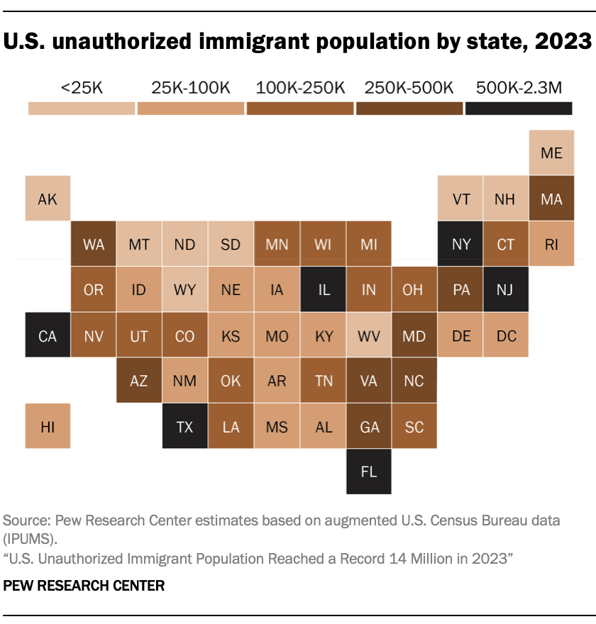
minus-squareHejMedDig@feddit.dklinkfedilinkEnglisharrow-up10arrow-down2·22 hours agoShouldn’t it be as a percentage of the state population?
minus-square9tr6gyp3@lemmy.worldlinkfedilinkEnglisharrow-up4arrow-down2·22 hours agoI don’t believe thats what they were trying to represent in this graph. This is estimating the total, not percentage.
minus-squareHejMedDig@feddit.dklinkfedilinkEnglisharrow-up7arrow-down2·21 hours agoYeah, but 100K in a 1 mio people state is a lot. Where as 100K in as 30 mio people state is not that many, and thus I think both should be shown
minus-square9tr6gyp3@lemmy.worldlinkfedilinkEnglisharrow-up3arrow-down1·21 hours agoI agree it would be nice to see a percentage based map as well, but OP didn’t post that
minus-squareNollij@sopuli.xyzlinkfedilinkEnglisharrow-up1·2 hours agoYeah, as it is it’s basically just a population map.
Shouldn’t it be as a percentage of the state population?
I don’t believe thats what they were trying to represent in this graph. This is estimating the total, not percentage.
Yeah, but 100K in a 1 mio people state is a lot. Where as 100K in as 30 mio people state is not that many, and thus I think both should be shown
I agree it would be nice to see a percentage based map as well, but OP didn’t post that
Yeah, as it is it’s basically just a population map.