Why does Africa, the largest continent, not simply eat the other ones?

Shouldn’t it say ‘this is the true size of Russian’? Africa is close to proportional, Russia is the half of the example stretched out.
Do we really need all this Mercator ragebait? Just look at a fucking globe - it’s the thing your dad keeps the scotch in.
(alternatively most map apps go to a globe view when you zoom right out.)
(and wait until you see the number the Tube Map did on south London.)
i mean, i’d say the lack of tube lines is the bigger issue
Not even a mention of africa
I really wish discussions of map projections would move beyond “wow look how badly mercator represents size”
This kind of post comes up like every week.
That’s why I always carry around my pocket globe and compass to scale and compare distances accurately.
Given all the comments missing the point (also written in the title), I appreciate that yours would pass the message better
Is it just me or do those pink versions of Russia include Crimea?
The Russian “11 time zones” fallacy. At the north pole you can get 24 time zones into one square meter.
I’m not sure I’ve ever seen a Mercator map except in internet content complaining about them
That seems like one of those education things.
Have you used Google Maps? Or OpenStreetMap?
Huh.
Well I’ll be damned! I actually thought Google zoomed out to a globe but that’s only on the satellite layer.
At least those tools actually are for navigation, not for showing the entire world.
I wish we would stop stretching land masses and start stretching oceans in basic maps. We don’t need the Mercator for naval navigation in our day to day lives, but knowing the real size of Russia and Africa would affect our basic view of the world.
If stretching is ok, then why not go all the way.
If you dislike stretching, you can always cut instead. That’s why we also have a series of octahedral butterfly maps.
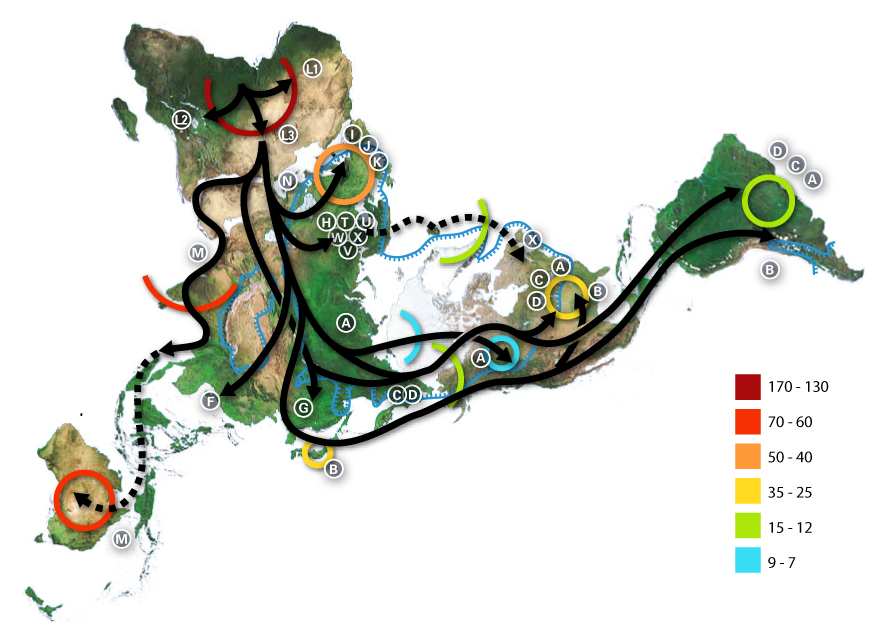
If that’s not polyhedral enough, you could try the Dymaxion projection instead.
i honestly really like dymaxion because it’s a nice aspect ratio and keeping the landmasses all together just feels right.
And it doesn’t even look strange if you just remove the ocean

S-tier cartography right there.
That butterfly one looks sick, I’m not a fan of the overplayed “world map in a cool material” wall-art but this one might get a pass depending on the execution.
There are several projections that follow this butterfly style. Still haven’t decided which one I want on my wall. There’s a local laser cutting company that definitely could make one out of plywood. I think it would look awesome.
Thanks, I hate you.
Silly Mercator projection
~Its gonna take a lot to drag me away from you~


