Attached: 1 image
The great map myth was incredibly unfair to the 'mother continent': This is the true size of #Africa
https://www.green.earth/blog/true-size-map-africa
I wish we would stop stretching land masses and start stretching oceans in basic maps. We don’t need the Mercator for naval navigation in our day to day lives, but knowing the real size of Russia and Africa would affect our basic view of the world.
That butterfly one looks sick, I’m not a fan of the overplayed “world map in a cool material” wall-art but this one might get a pass depending on the execution.
There are several projections that follow this butterfly style. Still haven’t decided which one I want on my wall. There’s a local laser cutting company that definitely could make one out of plywood. I think it would look awesome.
I wish we would stop stretching land masses and start stretching oceans in basic maps. We don’t need the Mercator for naval navigation in our day to day lives, but knowing the real size of Russia and Africa would affect our basic view of the world.
If stretching is ok, then why not go all the way.
If you dislike stretching, you can always cut instead. That’s why we also have a series of octahedral butterfly maps.
If that’s not polyhedral enough, you could try the Dymaxion projection instead.
i honestly really like dymaxion because it’s a nice aspect ratio and keeping the landmasses all together just feels right.
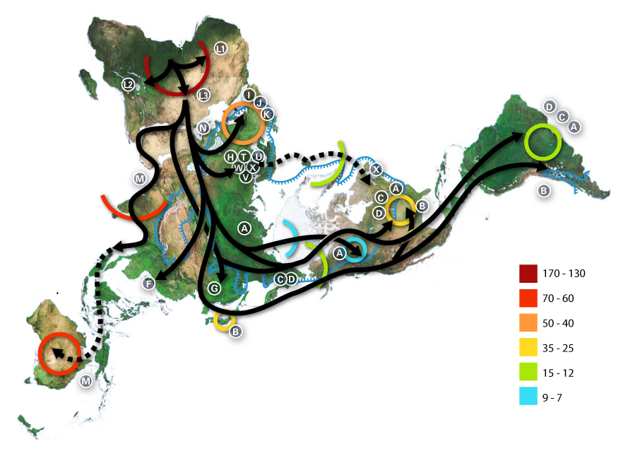
And it doesn’t even look strange if you just remove the ocean

S-tier cartography right there.
That butterfly one looks sick, I’m not a fan of the overplayed “world map in a cool material” wall-art but this one might get a pass depending on the execution.
There are several projections that follow this butterfly style. Still haven’t decided which one I want on my wall. There’s a local laser cutting company that definitely could make one out of plywood. I think it would look awesome.
Thanks, I hate you.