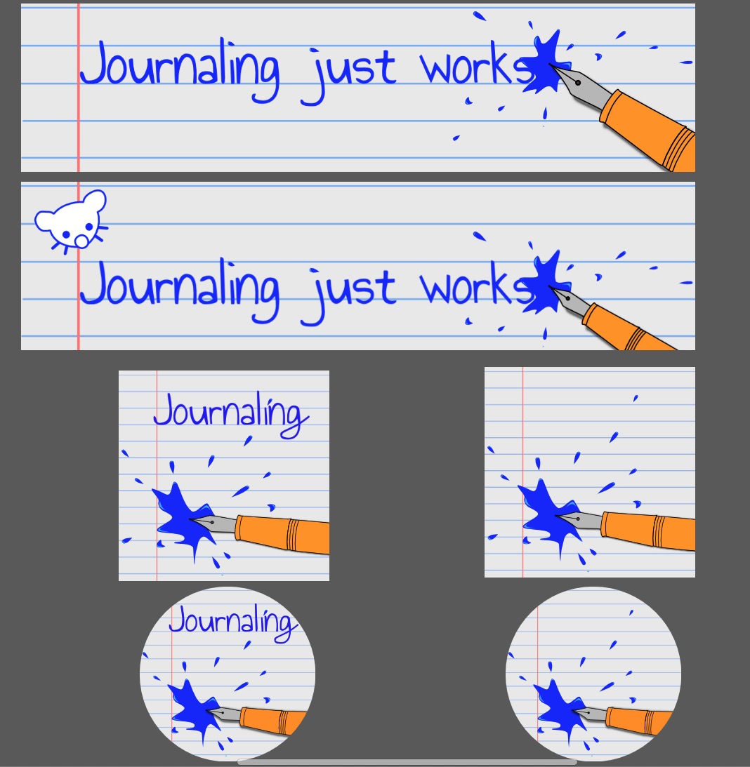
Edit 18/12: I updated the proposition, based on u/SomeAmateur remarks.
What do you think? Feel free to comment, even if it is to point out the things you don’t like, or that you don’t like this proposition at all and prefer the old one. I’m no logo designer, I can promise you won’t hurt my feelings ;)
Original post:
Since 2025 is getting closer I thought it might be a good opportunity to change the banner and the icon.
Here is a quick mock-up to promote something a tad less… serious.

There are two versions of the banner, one with and one without our dear Lemmy. And two versions of the community icon too, one with and one without the name in their default square shape and as a circular icon too, so you can get a better idea what they would look like.
What do you think? Is there one you prefer? Do they both suck, and the banners too?


I like round pen no text for the icon. Words on the icons are usually too small to read in most cases
Could we do just the text without the pen for the banner? So if you see the icon and the banner at once it isn’t showing two pens?
Thx!
That’s a good point. Something like that, then?
Yeah! And I would move the banner inkblot a little farther from the s in works to make it more legible. It kinda gets lost when I look at it but maybe that’s just me