
Please excuse the quality
This is a funny map because it’s super informative and I’m not sure I’ve gotten anything of substance out of it.
I’m sure it’ll be super useful in a fire :)
Is that a threat? W-why would they be in a fire?
With defunding fire fighters and climate change, you never know. Thank God we have that space lazer to control the weather, otherwise I’d be worried
Because they keep moving people’s desks and staplers. I saw a documentary.
The same reason you might if you keep asking questions …
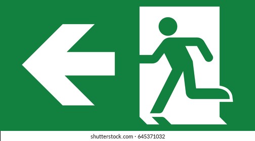
Canada’s building codes since around 2014 require the green man pictoral exit sign.
Old buildings have EXIT or SORTIE signs in red. Some renovated buildings have a mix of both.
Ahh yes I was surprised that they have the European (or just international idk) one
australia has them as well, so i’d assume general international
Is it based on red being the color of an emergency or it doesn’t look like a normal exit? Is it because they did studies on what is easier to see in smoke? Is it because green or red lights are cheaper?
I need answers
You’ll have to ask OSHA
What’s with NYC and yellow?
I was intrigued too but it just seems to be red. Not sure why they’ve singled it out
https://www.emergencylights.net/blogs/product-knowledge/new-york-city-exit-signs-info
I apparently live in a red state but my workplace (in state) is green
It seems many states actually allow both

I believe in Australia, by law it has to be green, except for parliment house because it’d ruin the aesthetic, so its allowed to be red (take with grain of salt, it’s been a while since I went to Canberra).
Now we just need to place them under the smoke at floor level
And green. At the floor and green. Green, at floor level.
fireexit
Because the hyphen or space keys are so far away.
Becausethehyphenorspacekeysaresofaraway.
ftfy
The green states should just secede.


