- cross-posted to:
- movies@lemmy.world
- cross-posted to:
- movies@lemmy.world
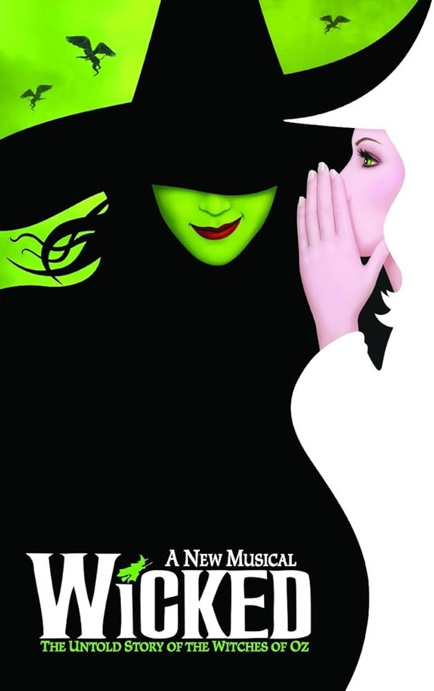
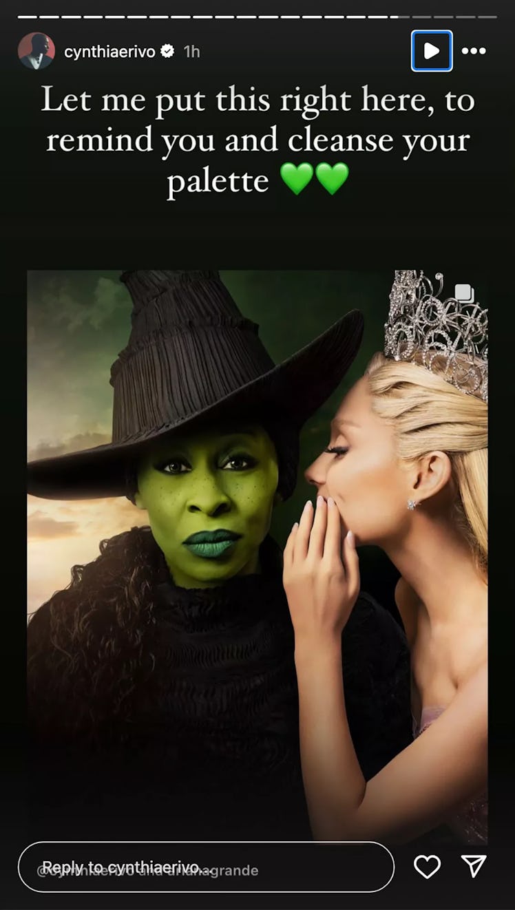
Fans customized the Wicked movie poster to more closely match the original Broadway poster.
Original Broadway Poster:

Movie poster:

Some fans, disappointed by the poster, altered it to be closer to the original, moving Grande’s hand and lowering the brim of Erivo’s hat to cover her eyes. The edits prompted Erivo to respond. “This is the wildest, most offensive thing I have seen
“None of this is funny. None of it is cute. It degrades me. It degrades us,” Erivo continued. “The original poster is an ILLUSTRATION. I am a real life human being, who chose to look right down the barrel of the camera to you, the viewer… because, without words we communicate with our eyes.”
So, this seems like a completely reasonable reaction to fans making fan content.


The small smile on her face I assume is a direct homage to the smile from the animated poster.
slight uptick in one corner of the mouth.
did any of you actually look at the official artwork poster with Cynthia on it?
various statements about her face are divorced from reality.
animated smile, camera right slightly raised corner of the mouth:
cynthia’s smile, camera right slightly raised corner of the mouth:
yeah… that’s not a smile.
Tomato potato hombre.
its the same half-smirk in the poster.
so if there was a smile, why did the edited poster have to have one edited in? She is not smiling in that photo. You can zoom in and point to any slight asymmetry you want. Fact of the matter is, if you ask anyone who’s not you, they’ll say she is dead serious
“so if there was a smile”
there is, as seen above and demonstrated in further detail below.
“why did the edited poster have to have one edited in?”
it appears they wanted a wider, more obvious smile and obviously wanted a different lip color.
maybe she likes big smiles.
and a different sky color for unknowable reasons.
“She is not smiling in that photo.”
Yes, she is.
here is cynthia not smiling, a resting face:
and here is Cynthia smirking with one corner of her mouth, a very obvious homage to the tilted animated smirk:
maybe you don’t see a lot of smiles regularly?
you seem unfamiliar with their properties.