- 4 Posts
- 10 Comments


 124·28 days ago
By measuring dialogue, we have much more objective measure of gender inclusivity.
So what? What now? Does a book/ movie/story get better if it’s 50/50?
It’s nice to analyse data but what is it good for?
Now, you could rank the movies by popularity and draw the conclusion that the more men talk, the more popular the movie.
Correlation != causality
 1·1 month ago
Thx!
I wasn’t able to debug it. Maybe next year or so
I had problems with podman/selinux and jellyfin and gpu acvelleration which is why I’m on debian now. I’d go with atomic any day if I could solve the problem but I don’t know how.
The graph wants to highlight you and connect the data with you. You could’ve simply shown that we’ve produced this much in the past 30 years. It is even the same graph but another interpretation. It is the same. You corrected that 🥰
What I don’t like is that we always put time on the x axis. Always. There is no reason to put it on the y axis for this plot.
And then, you start 100 years ago where it was 5%, etc. And the data increases over time, instead of decreasing.
The title is misleading. It’s not in your lifetime. It means in the readers lifetime. The graph show’s you and not me. You updated that in your graph which is awesome 🥰
Likely, This is it. It transcodes and hence it has to buffer because the server isn’t strong enough. Best is to use a gpu like intel a380 as described in jellyfin’s doc.
Why is turkey considered european?
Good catch!
Nuclear isn’t considered renewable.
I mean if countries like germany wouldn’t have stopped with nuclear, they could get rid of coal as well but their green no nuclear movement was strong
I love how green france is. France has how much nuclear energy? I trust their reactors but some people are against that form and in case something happens it’s worse than co2.
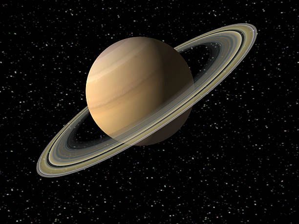
 1·3 months ago
Saturn is one step ahead of us

Storage is cheap. You suggest combining the images and storing the difference.
You can’t separate the images anymore. You have to store them in a container such that you have one common base image. You can then later on decide which image to look at.
You could also take a short video and only display one image.
Avif uses a video compression algorithm, meaning it’s basically one frame of a video.
Btw, I wouldn’t care about your problem. Storage is cheap. Try saving 10 4k videos and you’ll laugh about your image library