that every panel is slightly different but featuring the same content(for example the “He” on helium is very slightly different in every panel, a regular artist would copy paste the text, not draw it every frame),
the font not being consistent(Look at the “E” in “HELIUM WALKS” and then the “E” in “WE DON’T”),
the absence of period symbols(Image Generation LLMs love to do this)
and the artstyle is very specific to other AI comics that are currently floating around the net.

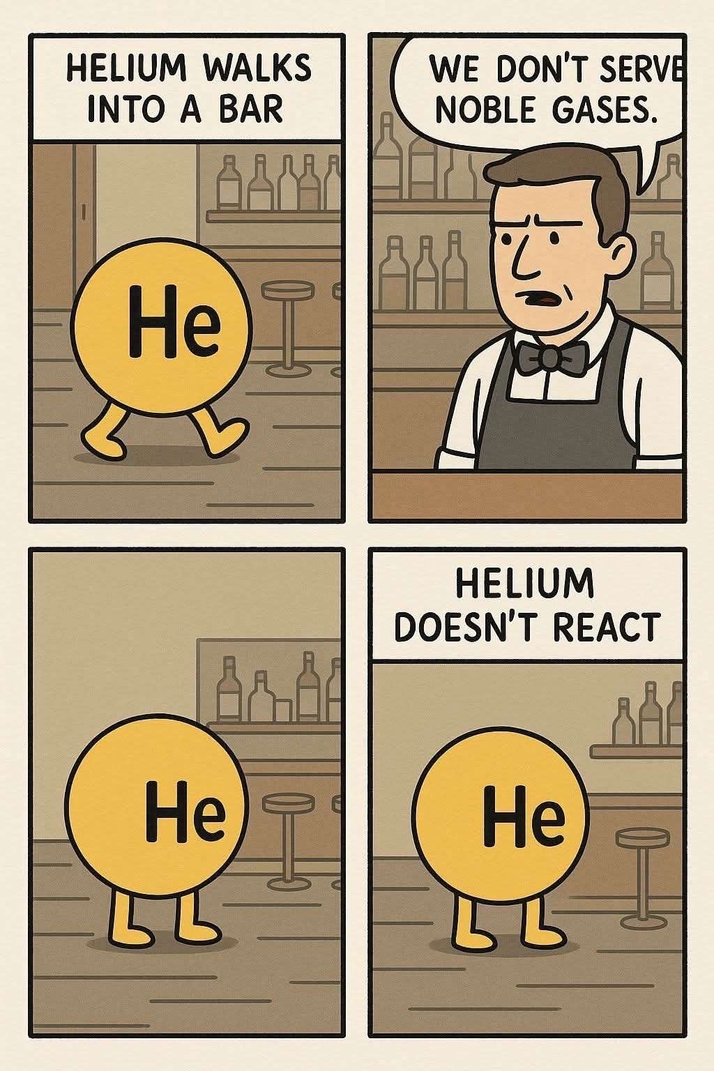
AI comic 😞
How can you tell?
edit: I learned a lot today
The inconsistent backround,
the cutoff text in the second panel,
that every panel is slightly different but featuring the same content(for example the “He” on helium is very slightly different in every panel, a regular artist would copy paste the text, not draw it every frame),
the font not being consistent(Look at the “E” in “HELIUM WALKS” and then the “E” in “WE DON’T”),
the absence of period symbols(Image Generation LLMs love to do this)
and the artstyle is very specific to other AI comics that are currently floating around the net.
Also, the off-white color used. AI HATES using pure white backgrounds for comics for some reason.
deleted by creator
I’ve resigned myself that this will be the state of memes in the future, but god would I take a paint doodle over this.
… only for ai to start drawing paint doodles because making an effort is not a human nature