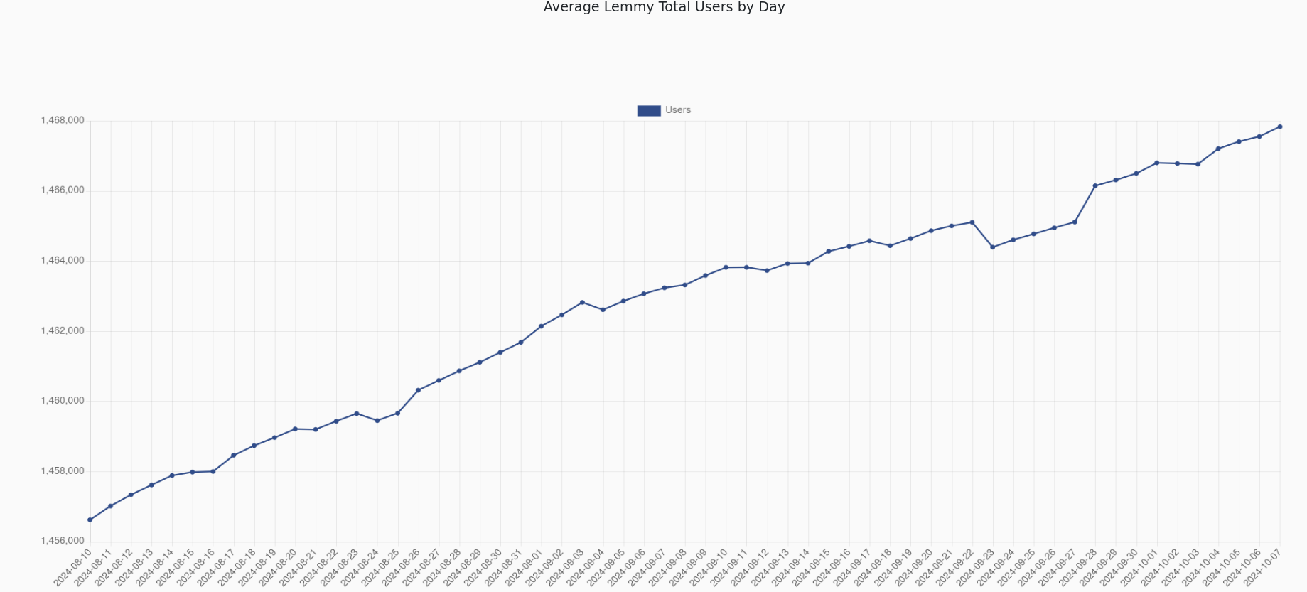
In the last 3 months it went down by about 10,000 users. Comparing with the rate of increase in total Lemmy users, active user rate should have at least been stable. I guess we will have to wait for reddit to fuck up again for another influx. And Lemmy is only getting better with time so probably on every influx more users are going to stay.
I try to get people from niche subs I follow to move to Lemmy but every time I do I get downvoted. Could be automated by reddit idk
If you start at 0, you see exactly what you’re supposed to: there is a rather negligible trend in the given timeframe.
That’s the point. The number of users has very slightly declined in the past few months. Under the original plot, you have a lot of people (rightly) misinterpreting the data, and saying that a lot of users are leaving the site.
That’s why you start at 0. So that people interpret the data correctly.

Insane to start the plot at 45k. The rate of decline is rather minimal
In the last 3 months it went down by about 10,000 users. Comparing with the rate of increase in total Lemmy users, active user rate should have at least been stable. I guess we will have to wait for reddit to fuck up again for another influx. And Lemmy is only getting better with time so probably on every influx more users are going to stay.
I try to get people from niche subs I follow to move to Lemmy but every time I do I get downvoted. Could be automated by reddit idk
People generally don’t like being proselytized.
Right. Just make great lemmy content and screenshot it. Then when people ask for the source you provide the lemmy link
deleted by creator
If you start the plot at 0, you can distinguish between a strong trend, a weak trend and a lack of a trend. This one is terrible for gauging that.
deleted by creator
Let’s put that to a test
deleted by creator
If you start at 0, you see exactly what you’re supposed to: there is a rather negligible trend in the given timeframe.
That’s the point. The number of users has very slightly declined in the past few months. Under the original plot, you have a lot of people (rightly) misinterpreting the data, and saying that a lot of users are leaving the site.
That’s why you start at 0. So that people interpret the data correctly.
deleted by creator
deleted by creator